I created this demo for ECE 228 “Machine Learning for Physical Applications.” It demonstrates how to load, visualize, and analyze data from the NOAA GSOD dataset.
I’ve added a demo for prediction of seasonal timeseries, using the FFT to find major seasonal cycles, and SARIMAX (seasonal arima model) to predict. This notebook loads and visualizes data from the NOAA GSOD dataset into Pandas dataframe (2014 to 2018, access via BiqQuery API: https://cloud.google.com/bigquery/public-data/)
1 Include packages
Code
import warningswarnings.filterwarnings("ignore")import numpy as npimport pandas as pdfrom pandas.tseries.offsets import DateOffsetimport matplotlib import matplotlib.pyplot as pltimport globfrom mpl_toolkits.basemap import Basemapimport matplotlib.pyplot as pltimport scipy.signal as sigimport timeimport datetime# signalprocessingfrom scipy.fftpack import fft, ifft, fftfreqimport matplotlib.pyplot as pltimport statsmodels.api as smaimport statsmodels.tsa.statespace.api as smfrom statsmodels.tsa.stattools import adfullerfrom numpy.random import randintimport matplotlib.dates as mdates# print(pd.__version__)
2 Load the data
After storing the data locally, load 5 years from 2014-2018 into a dataframe.
Code
dataset_path='datasets/NOAA_SST/'fpath = dataset_path # + 'noaa_gsod/'pandas_files =sorted(glob.glob(fpath +'noaa_gsod.gsod*'))pandas_files = pandas_files[-5:] # Take the last five yearsstations = pd.read_pickle(dataset_path+'noaa_gsod.stations') # load station datastations = stations[stations['begin'].astype(int)>20140101] # station data for the past 5 yearsdf =Nonefor i, fi inenumerate(pandas_files): dtmp = pd.read_pickle(fi)# read year from the filename and add as a column yr =int(fi[-4:]) dtmp['yr'] = yr*np.ones(len(dtmp),).astype(int)# create a datetime column, makes plotting timeseries easier dtmp['Datetime'] = pd.to_datetime((dtmp['yr'].astype(str) + dtmp['mo'].astype(str) + dtmp['da'].astype(str)),\format='%Y%m%d')# stick the years together df = pd.concat([df, dtmp], ignore_index=True)
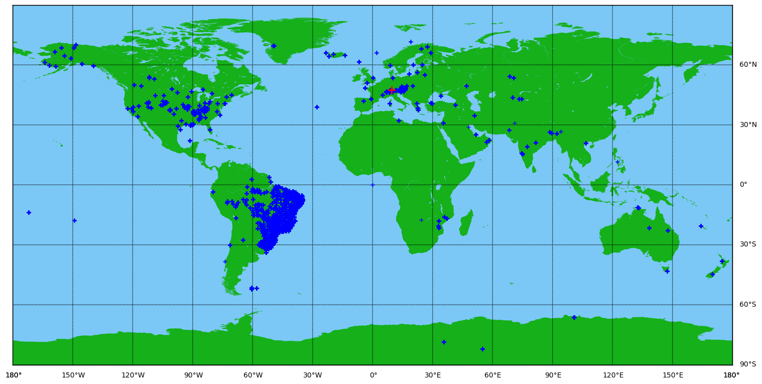
np.random.seed(33) # set the seed to show the same example every time for the demors = np.unique(df_all['stn'].values) # find unique stations with datarand_stat = rs[randint(len(rs))] # pick a random stationfeatures = df_all.loc[df_all['stn'] == rand_stat] # pick weather at random stationfeatures = features.drop(columns=['stn','max','min'], axis=1)features = features.sort_index()# View station locationsfig = plt.figure(figsize=(18.5, 10.5))m = Basemap(projection='cyl',llcrnrlat=-90,urcrnrlat=90,\ llcrnrlon=-180,urcrnrlon=180, resolution='l')# Make map look prettym.drawmapboundary(fill_color='xkcd:lightblue')m.fillcontinents(color='xkcd:green',lake_color='xkcd:lightblue')m.drawmeridians(np.arange(0.,350.,30.),labels=[True,False,False,True])m.drawparallels(np.arange(-90.,90,30.),labels=[False,True,True,False])# plot the stations with blue plusseslon = df_all['lon'].tolist()lat = df_all['lat'].tolist()xpt,ypt = m(lon,lat)m.plot(xpt,ypt,'b+') # Show the position of the stationprint('Station ID: ', rand_stat, '. Number of samples: ', len(df_all.loc[df_all['stn']==rand_stat]))lon = features['lon'].tolist()lat = features['lat'].tolist()m.plot(lon, lat,'r+',markersize=10) plt.show()
Station ID: 066900 . Number of samples: 1786
Figure 1: A map using a cylindrical projection and showing all stations with data from 2014 through 2018 (blue +) with a randomly selected station (red +).
5 Plot temperature timeseries
Code
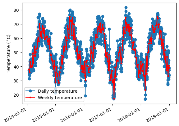
x = features['temp'].valuesxmean = np.mean(x)# Remove the mean for processingy = x - xmeanN =len(y)downsamp =7yt = sig.decimate(y, downsamp)tst = features.index[::downsamp]# Check if it's stationary! (it's not)# test = adfuller(y)# print(["It's stationary" if test[1]<0.05 else "It's not stationary"])fig=plt.figure()ax = fig.add_subplot(111)#ax.scatter(features.index, x)ax.plot(features.index, x, marker='o')ax.plot(tst, yt+xmean, zorder=3, marker='o',color='r',markersize=3)ax.xaxis.set_major_formatter(mdates.DateFormatter('%Y-%m-%d'))fig.autofmt_xdate()plt.legend(['Daily temperature','Weekly temperature'])plt.ylabel('Temperature ($^\circ$C)')plt.show()
Temperature from a random station shown at daily and weekly resolution.
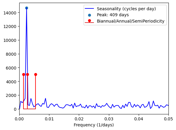
A frequency plot showing the seasonality of temperature at the random location.
7 Train a SARIMAX model on weekly temperature
Code
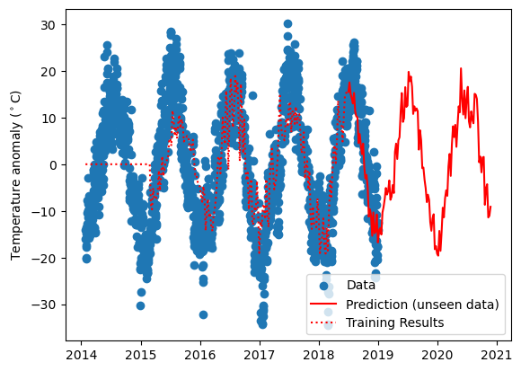
tpred =100# predict 100 days into the futureNtrain =230#len(tst[tst<datetime.datetime.strptime('January 1, 2018','%B %d, %Y')])traindata = yt[0:Ntrain]testdata = yt[Ntrain:]ts_pred = [tst[-(len(yt)-Ntrain)] + DateOffset(days=i) for i inrange((tpred+len(yt)-Ntrain)*downsamp)]ts_pred = ts_pred[::downsamp]# use seasonal arima modelmod = sm.SARIMAX(traindata, order=(0, 0, 0), seasonal_order = (2,0,2,np.floor(1/freq[pkfreq[0]]/downsamp)))res = mod.fit()train = res.predict(1, Ntrain)prediction = res.forecast(tpred+ (len(yt)-Ntrain))plt.figure()plt.scatter(features.index, y)plt.plot(ts_pred, prediction,'r')plt.plot(tst[:Ntrain], train, 'r:')ax.xaxis.set_major_formatter(mdates.DateFormatter('%Y-%m-%d'))fig.autofmt_xdate()plt.ylabel('Temperature anomaly ($^\circ$C)')plt.legend(['Data','Prediction (unseen data)','Training Results'])plt.show()
Temperature at a random station along with the SARIMAX predictions on training (dashed red) and unseen data (solid red). The model requires a ramp-up period of about 1 year at weekly resolution.